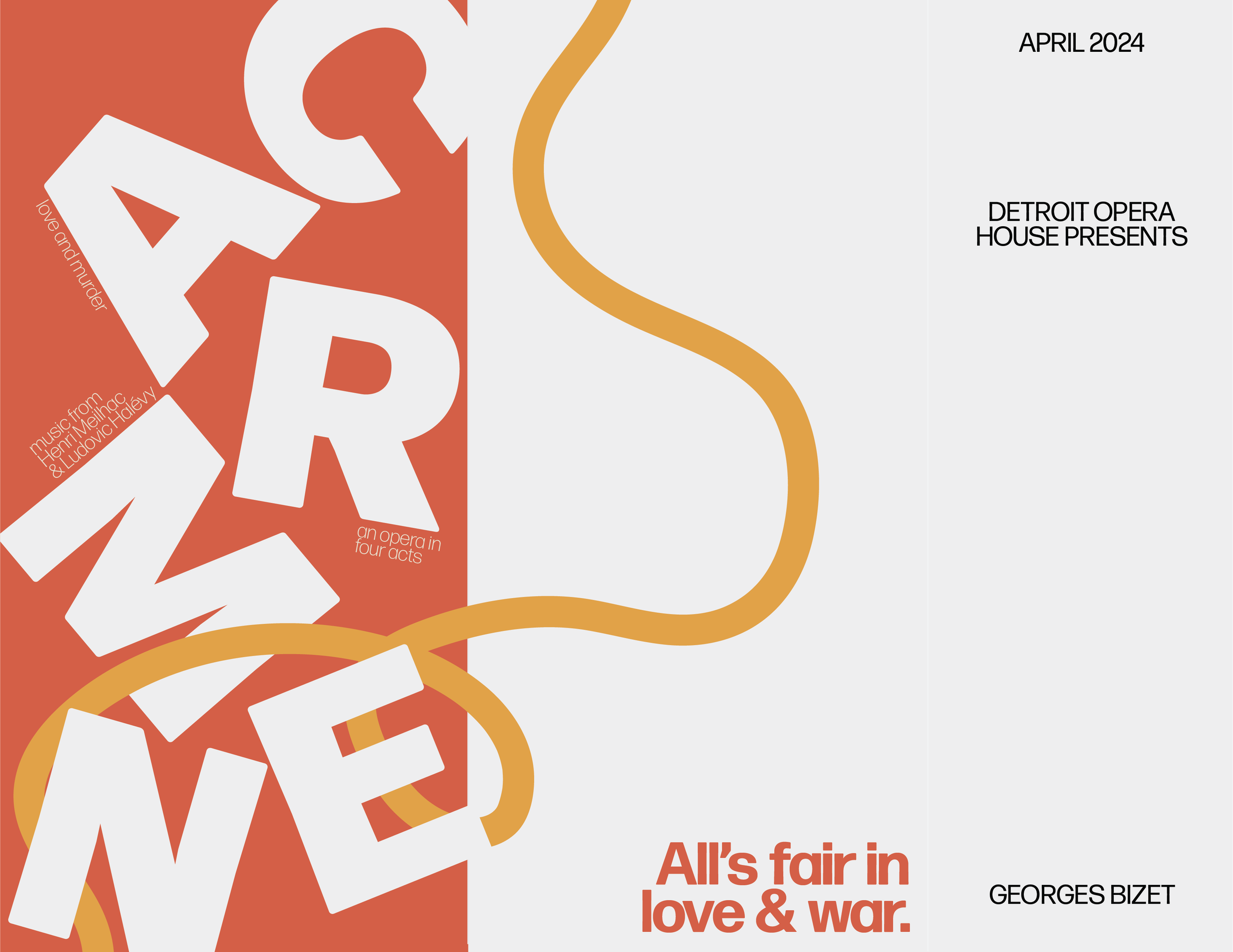
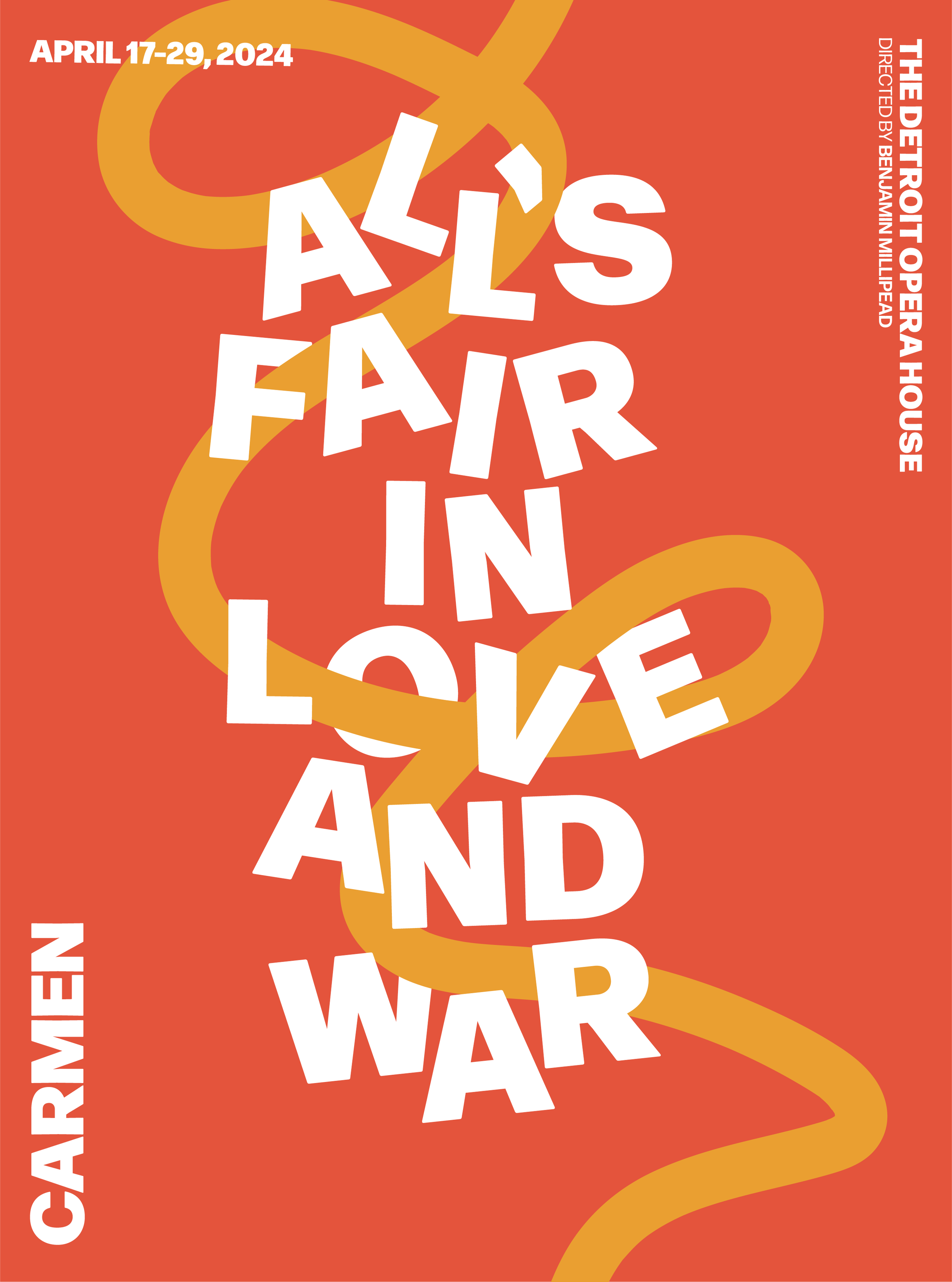
All’s Fair in Love and War
CLIENT:
PROJECT DURATION:
March 2024
ROLE:
Brand Identity Strategy
Brand Identity Design
Print Design
Customer Experience (CX) Design
Illustration
Messaging
Project Overview
Project Goals
Create a cohesive poster and program system for the Detroit Opera House’s performance of Carmen
Use experimental typography to visually express the opera’s themes of passion, obsession, and tragedy
Allow typography to take center stage as the primary storytelling element
Balance contemporary typographic exploration with the historical weight of a world-renowned opera
Project Challenges
Translating an emotionally intense, narrative-driven performance into purely typographic form
Maintaining legibility and hierarchy while pushing expressive, experimental type treatments
Designing within the formal expectations of an opera audience while still introducing bold, modern visual language
Ensuring consistency between the poster and program while allowing each to function independently
Project Outcomes
The final outcome was a cohesive poster and program system that combined striking experimental typography with intentional hierarchy. The designs allowed type to embody the drama of Carmen, creating a visual identity that felt theatrical, emotive, and contemporary while honoring the timeless intensity of the opera.
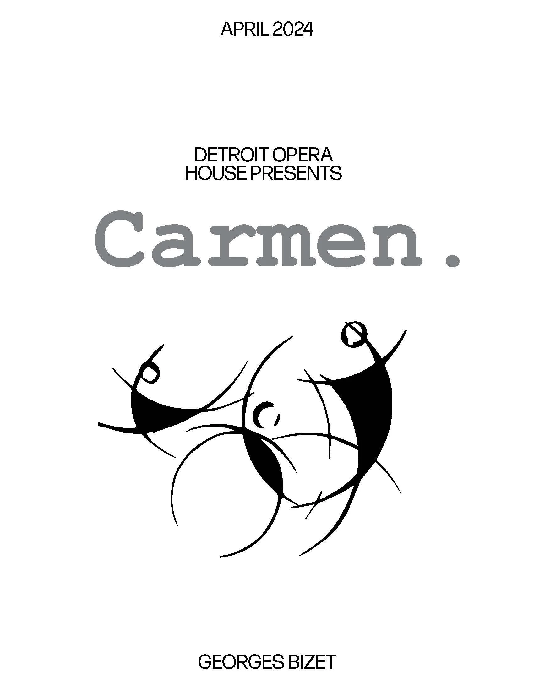
For this project in Experimental Typography, I was tasked with creating a poster and program for the Detroit Opera House’s performance of Carmen. First performed in 1875, Carmen is one of the world’s most famous operas, a story of love, obsession, and tragedy set against the vibrant backdrop of Seville, Spain.
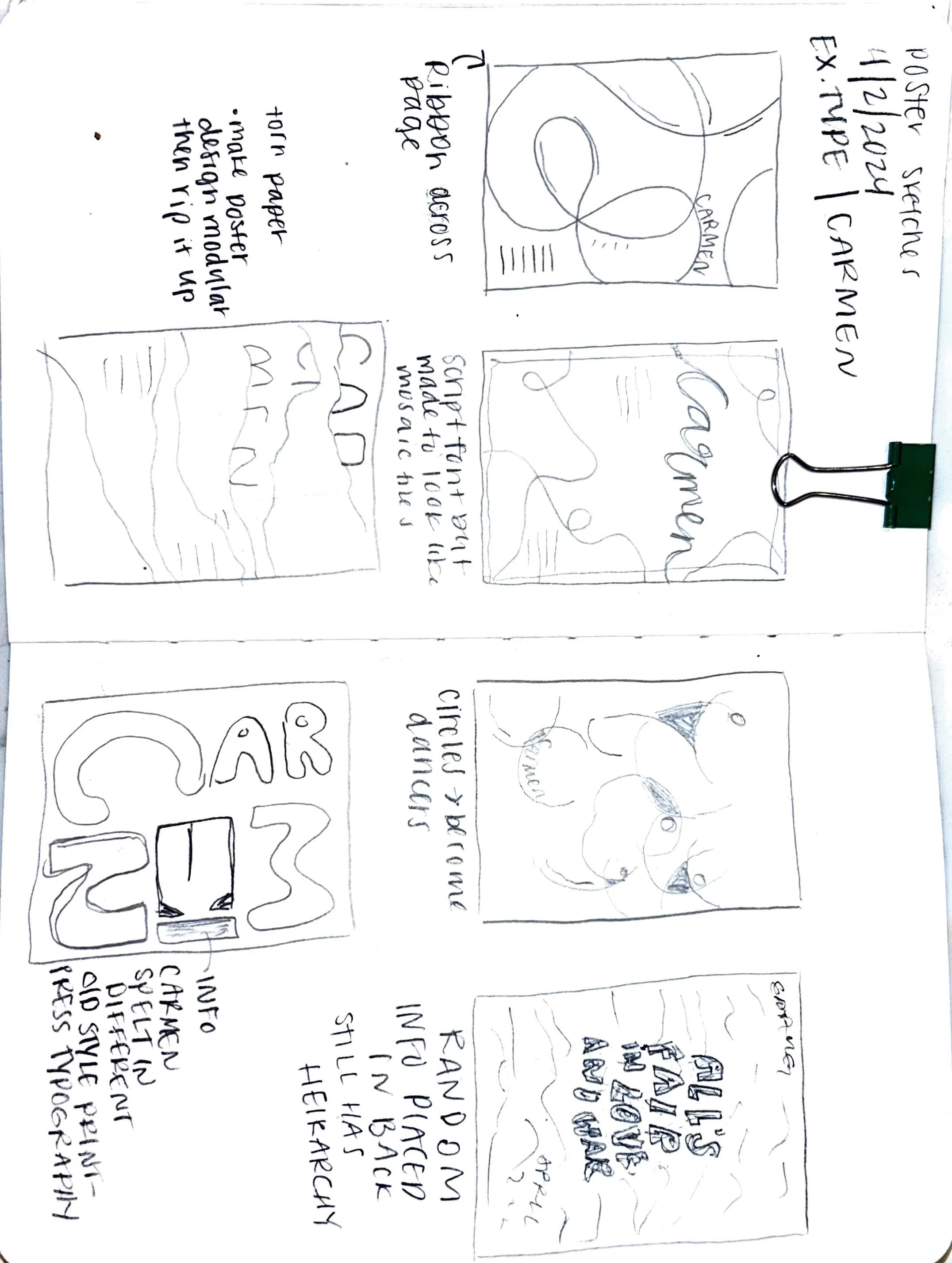
My process began with typographic experiments, exploring expressive forms that could capture both the drama and intensity of the story. I developed progress studies and type-setting tests before moving into final layouts. The strategy was to let the typography become the main storyteller: bold, emotive, and theatrical, mirroring the opera’s spirit.
The final outcome was a cohesive poster and program system that combined striking experimental type with intentional hierarchy, creating a design that felt both contemporary and true to the timeless power of Carmen.
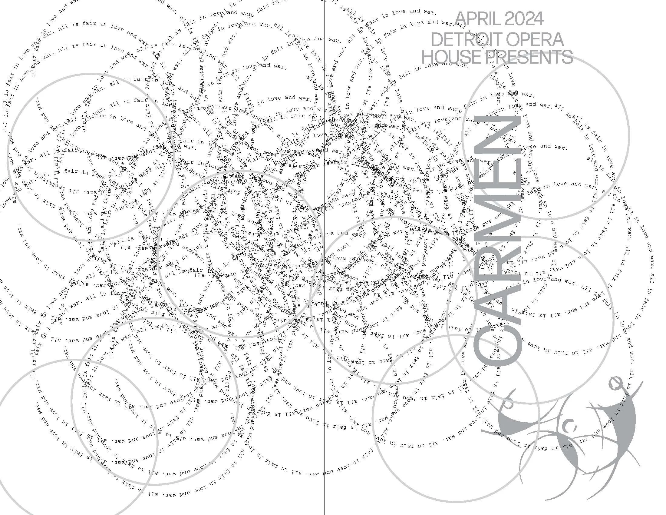
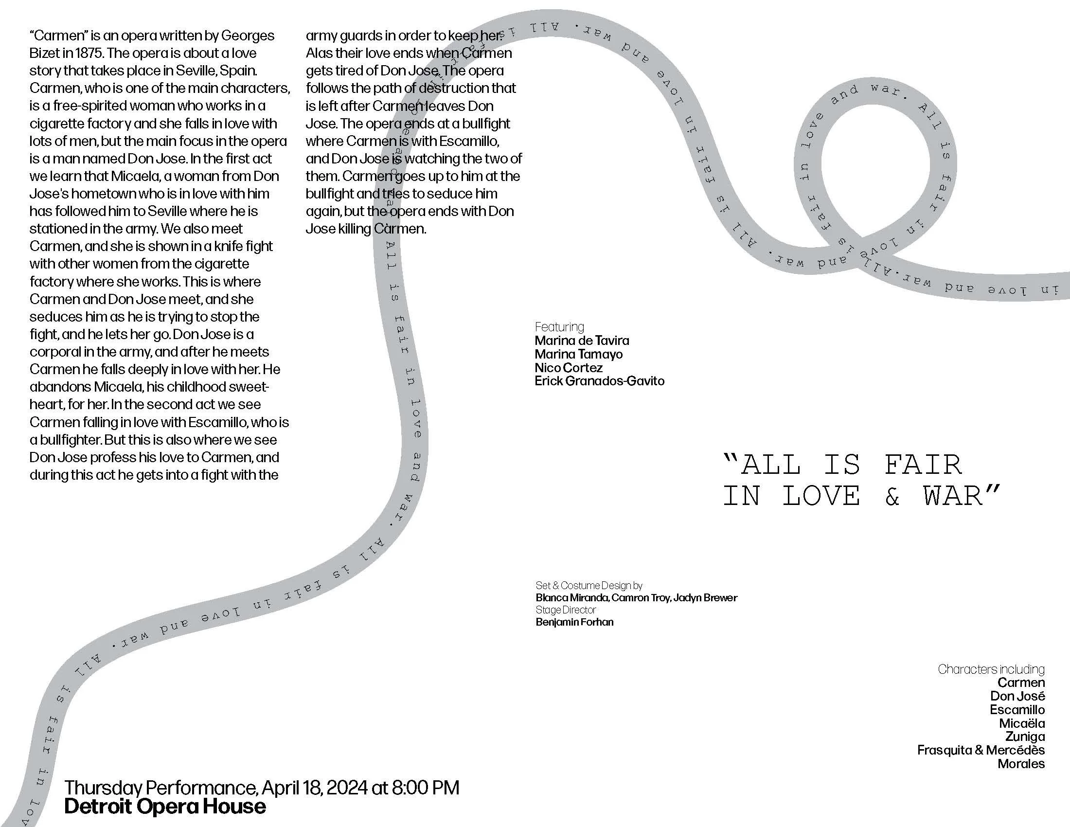
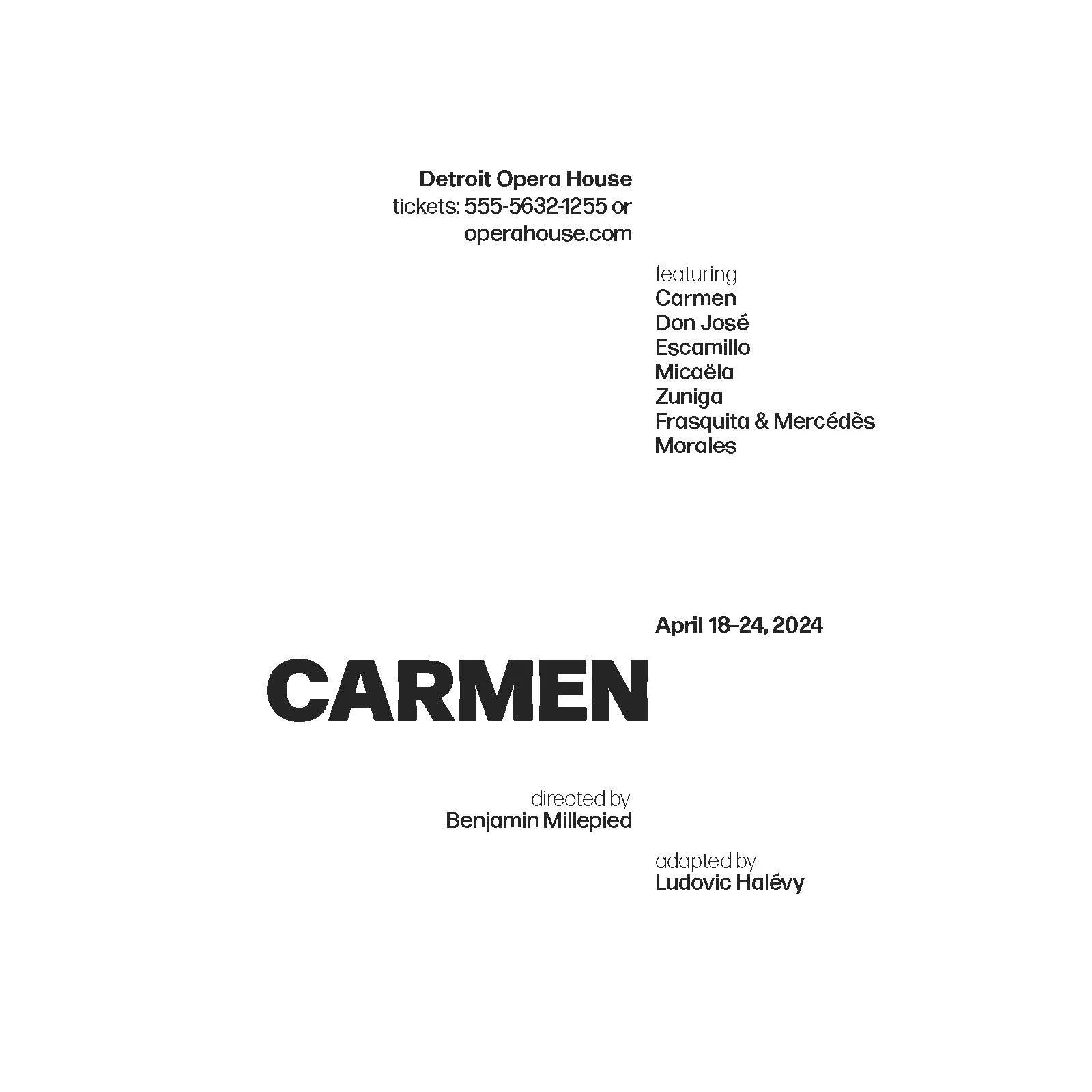
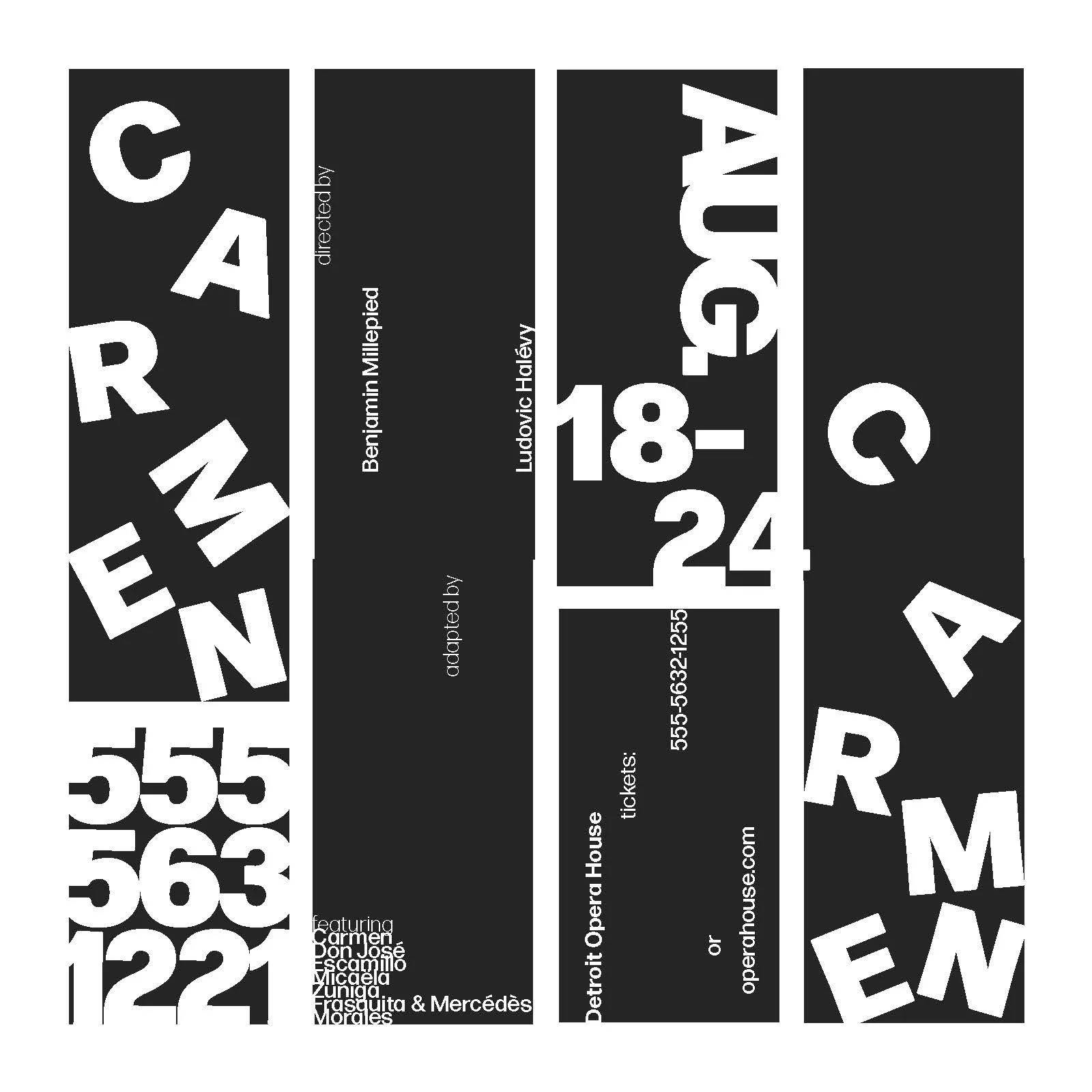
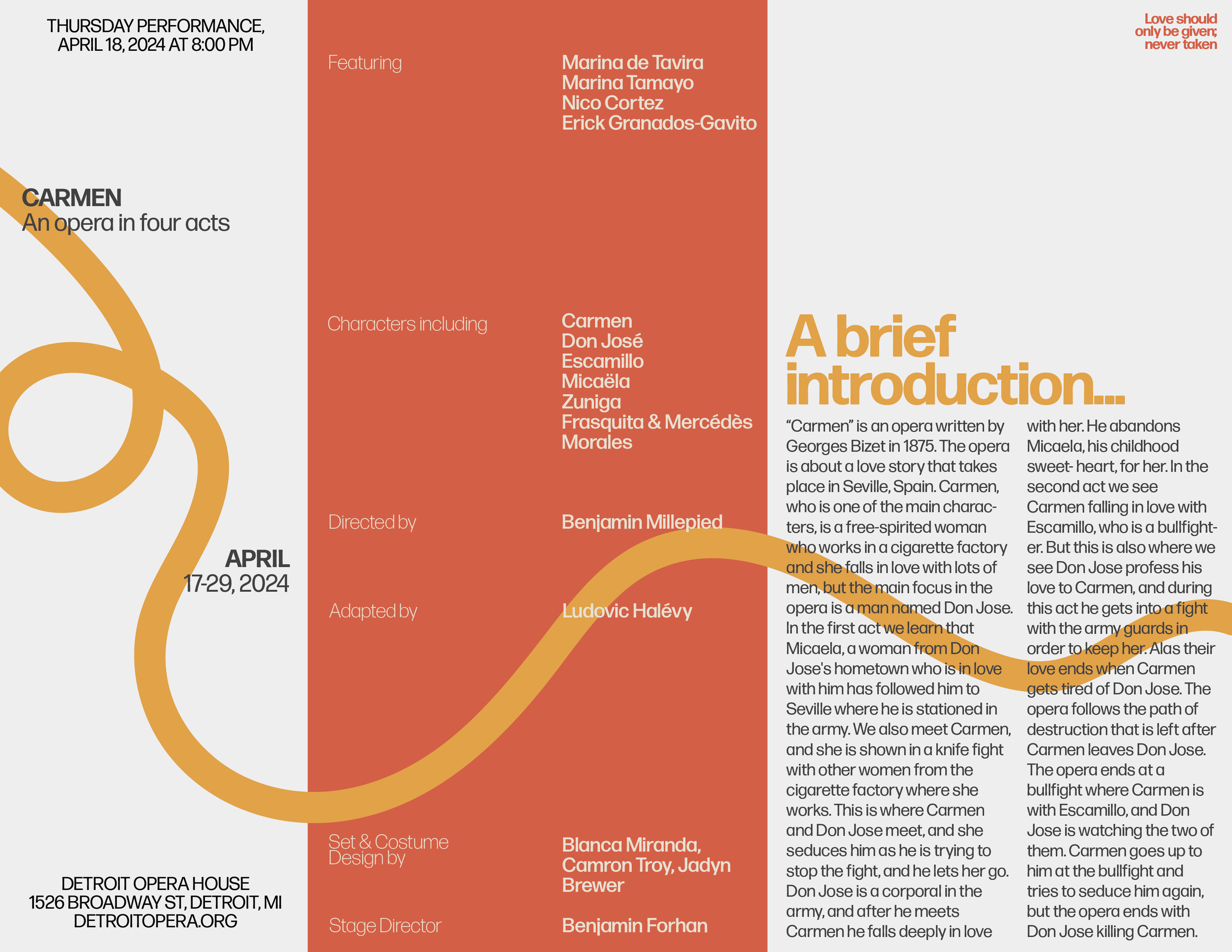
THE FINAL PROGRAM
The finished program was designed as a companion piece to the poster, carrying the same dramatic typographic voice throughout its pages. Careful attention to hierarchy and layout ensured the information remained accessible while still capturing the energy of the performance. The result is a program that feels both functional and expressive, giving audiences a tactile introduction to Carmen before the curtain even rises.
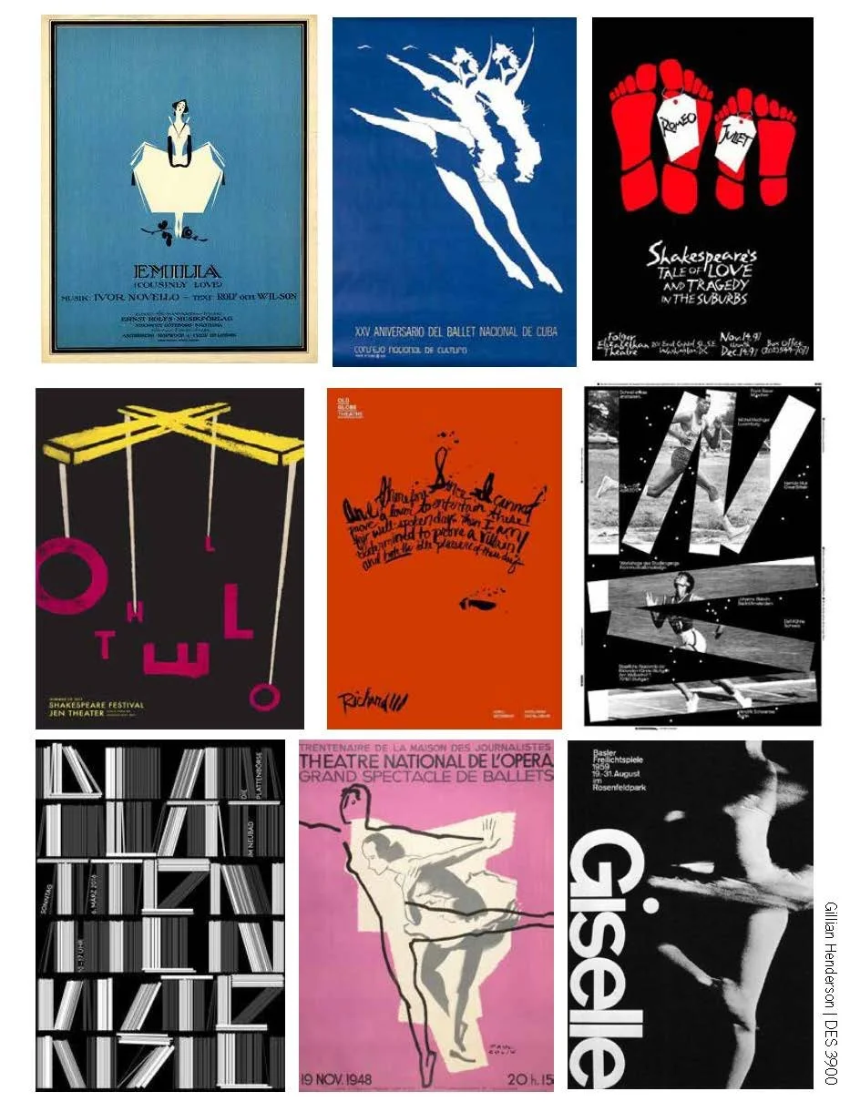
BEHIND THE PROCESS
This section highlights my process work, including early sketches, type-setting experiments, and layout studies. Exploring different letterforms and compositions allowed me to push the boundaries of expression before arriving at the final design. These progress pieces show how experimentation shaped the visual language of the project.