
Dyslexia: Dyslexia + Helvetica
CLIENT:
Myself :)
PROJECT DURATION:
January - April 2024
ROLE:
Project Direction
Typography Creation
Print DesignVideo Design
Website Design
Project Overview
Project Goals
Use design for good; to explore ways that design can be used to spread awareness for ideas and movements
Use experimental typography to visually express the challenges of reading with Dyslexia
Allow typography to take center stage as the primary storytelling element
Project Challenges
Experimenting with typography to push my experience with dyslexia, but still make the project legible and understandable
Maintaining legibility and hierarchy while pushing expressive, experimental type treatments
Designing within the expectations of Oakland University’s Graphic Design Senior Thesis class
Ensuring consistency between the poster and videos while allowing each to function independently
Project Outcomes
The final outcome was a typeface that illustrated my personal experience with Dyslexia, and using it in a series of posters, videos, zines and signage that allowed the viewer to experience my perspective. This project was awarded Best in Show in the 2024 Senior Exhibition show at Oakland University. The experiment continues to inspire individuals to step into the shoes of others, give grace, and raise awareness to this learning disability that impacts a large percentage of the population.
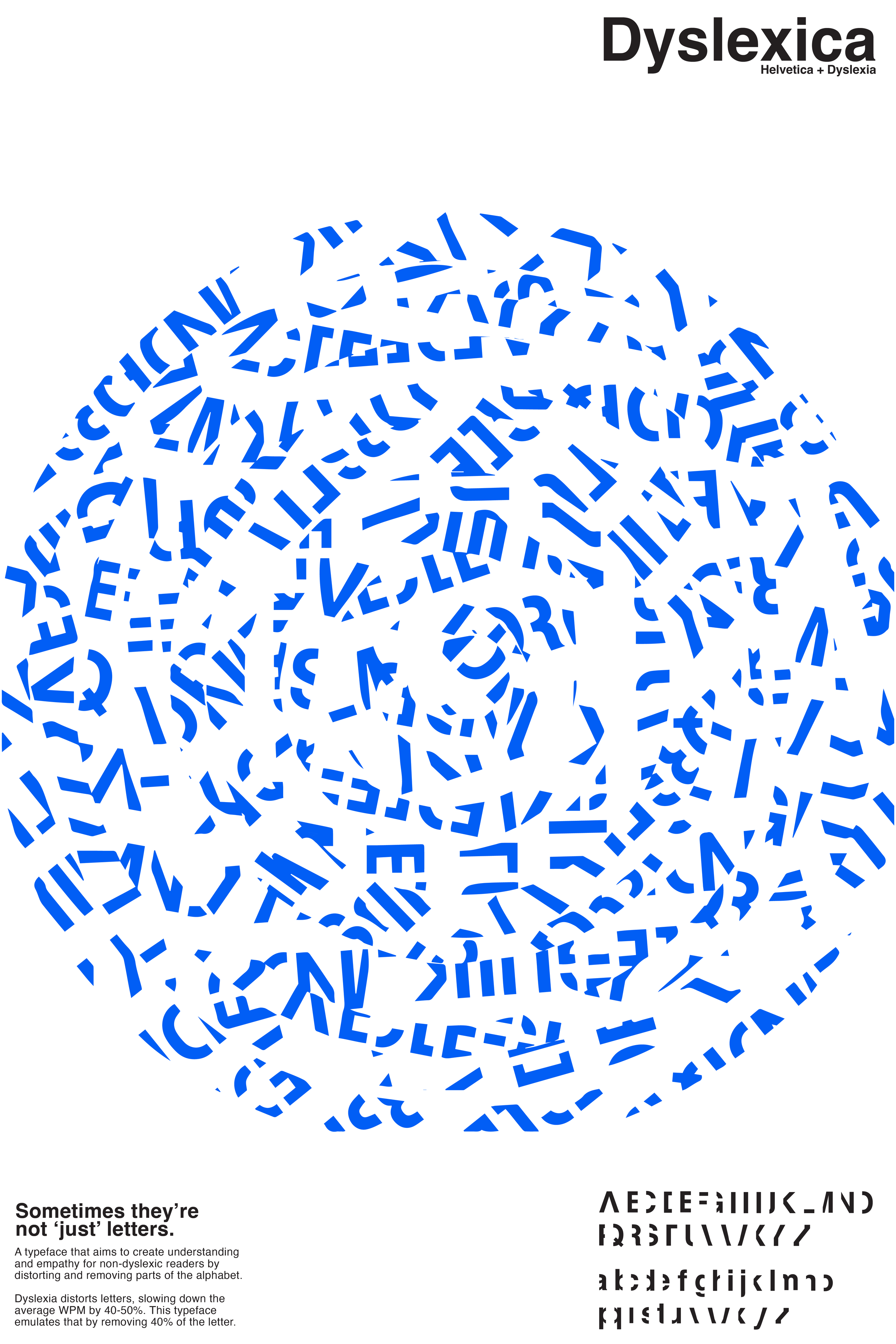
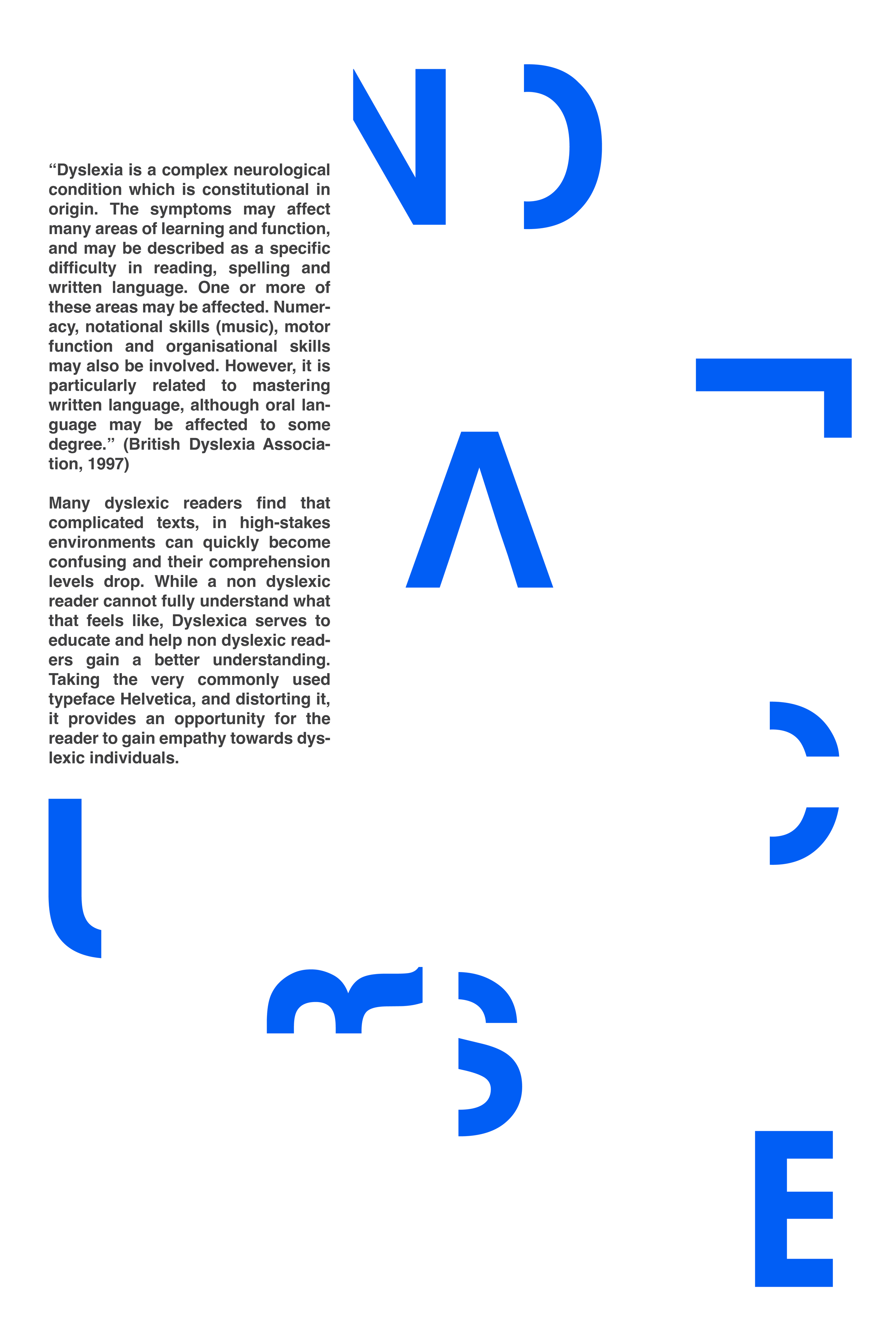
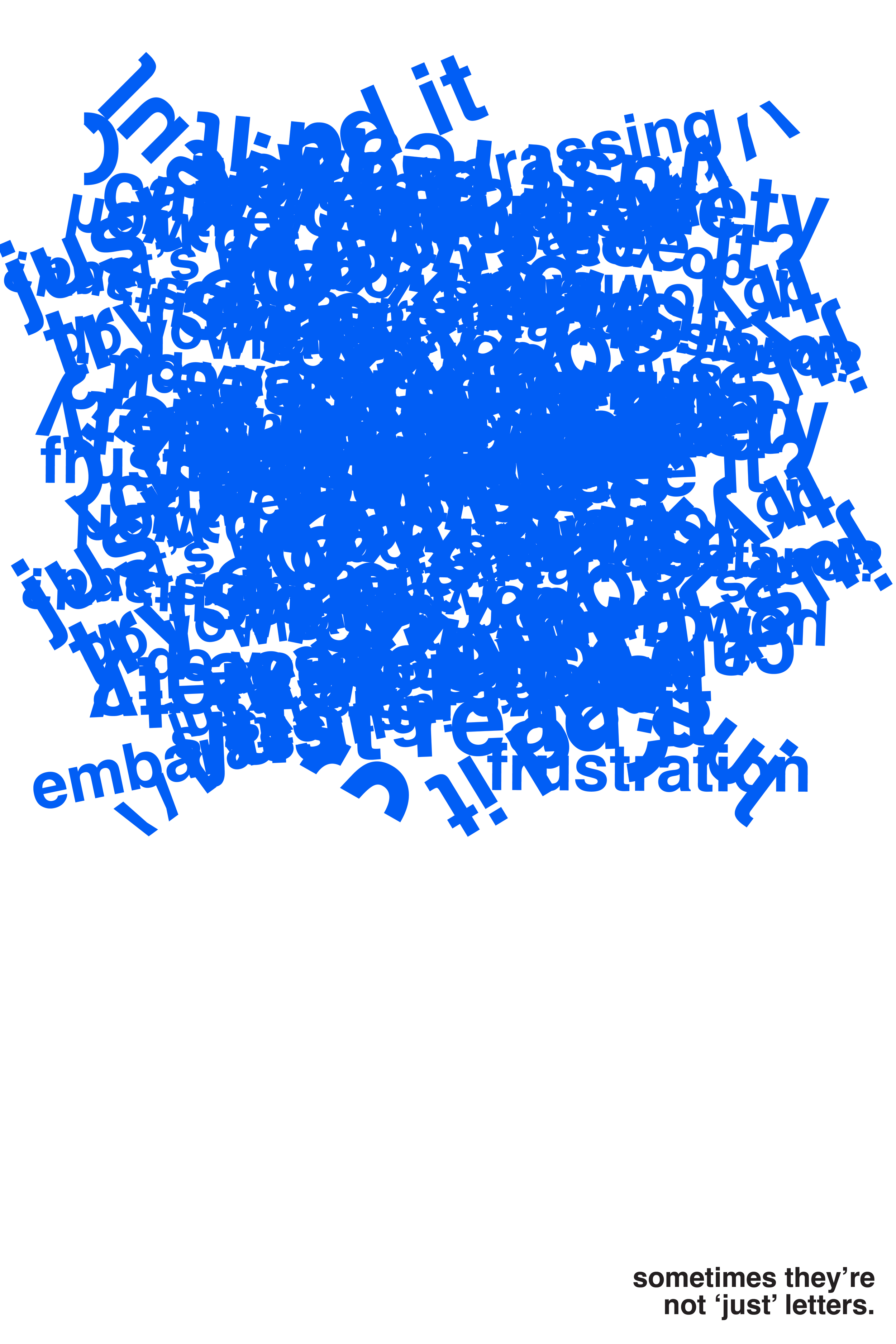
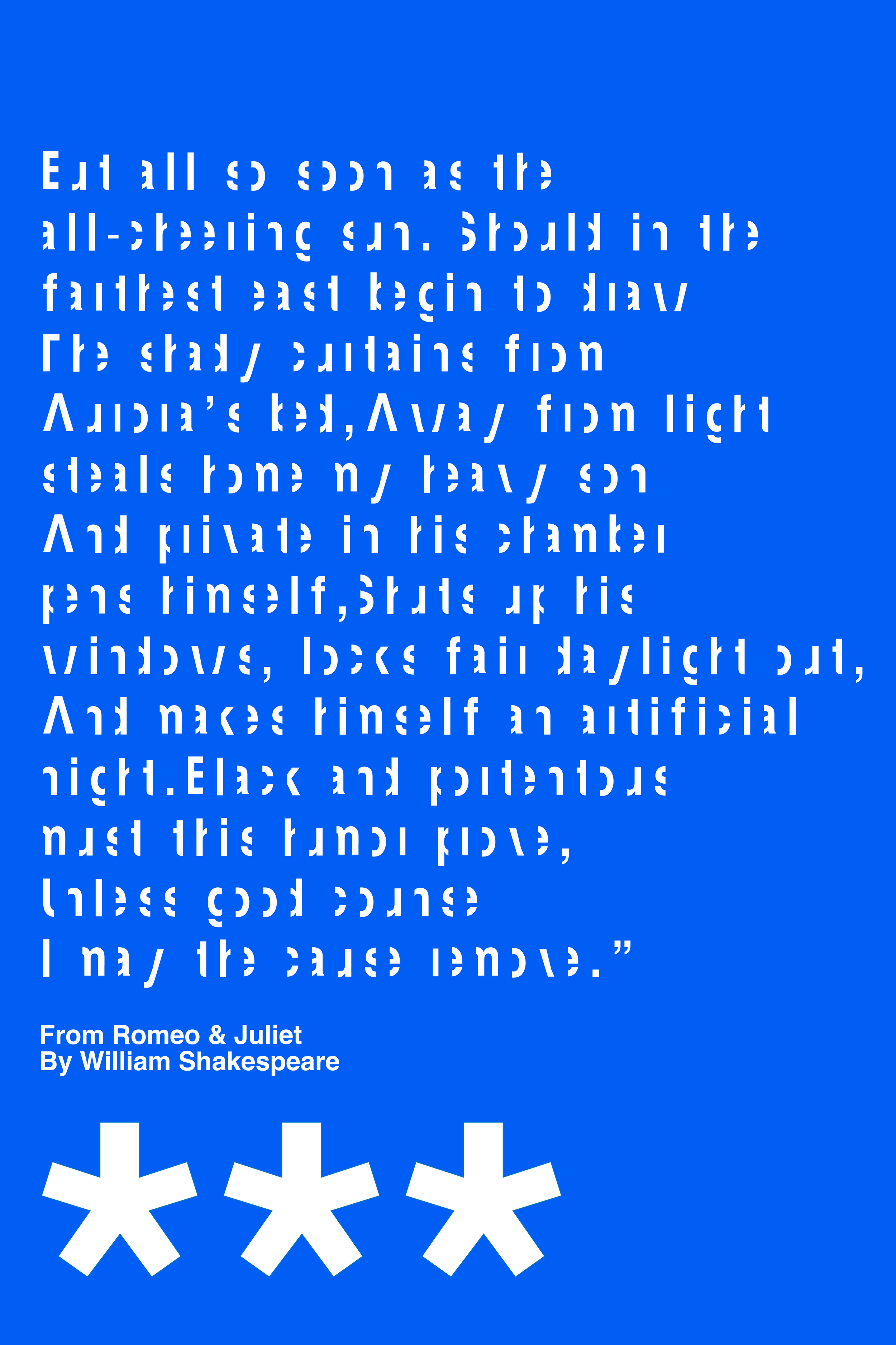
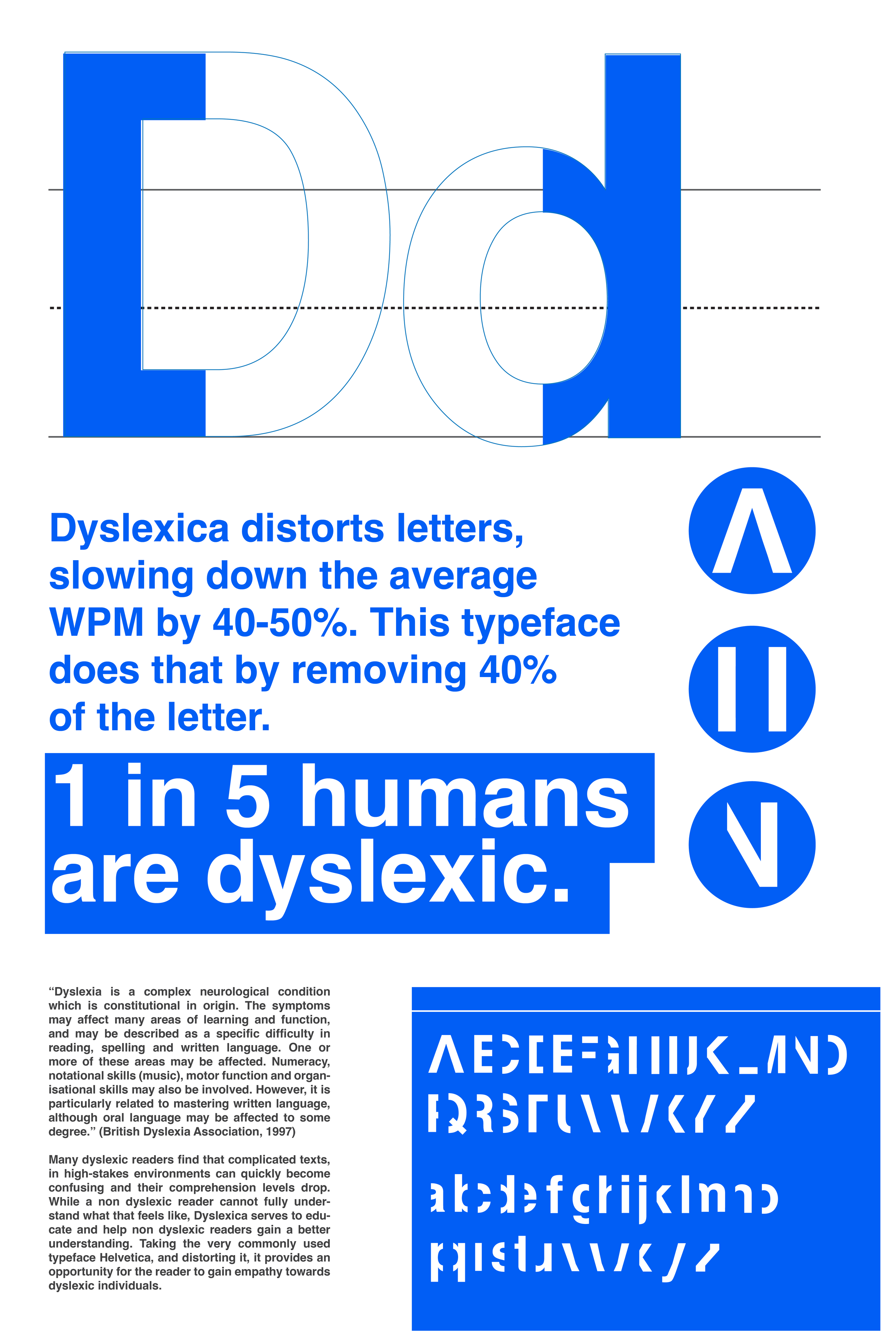
Dyslexia is a learning disorder that affects on average one out of every five people (that’s a lot of people). It affects readers in many different ways, but in simplest terms can be described as where letters and words are ‘swimming’ ‘jumping’ and ‘disappearing’ as you are reading. I wanted to create a typeface that gives perspective on how it feels to read with dyslexia. Illustrating the frustrations that myself, and many other individuals deal with on a daily basis.
By removing distinguishing characteristics of letters it creates confusion and chaos— which is how dyslexia can sometimes feel. My typeface, Dyslexica, visualizes my unique perspective and experience, and aims to create a sense of compassion and understanding of non-dyslexic readers.
Oakland University Art Gallery - Best In Show - 2024 -
Oakland University Art Gallery - Best In Show - 2024 -
THE FINAL TYPEFACE

A Big Thanks to:
My professors Maria Smith Bohannon and Meaghan Barry for their constant encouragement and feedback throughout my time in the Graphic Design department at Oakland University. I truly owe my love and passion for typography to Maria— she has shown me and given me permission to experiement with typography, and she helped me realize that type can always be more than just letters.
I would also like to thank my Mom and Dad for encouraging my dreams, and letting me pursue my passion for graphic design. And thank you to Mano and Anh for being the best of friends and always inspiring me and pushing me to create more. Who knew that GD1 with Kimmie would be the start to so much more than our graphic design careers?